Brand & Product Redesign
How product and design systems informed a company-wide brand refresh with TMP.

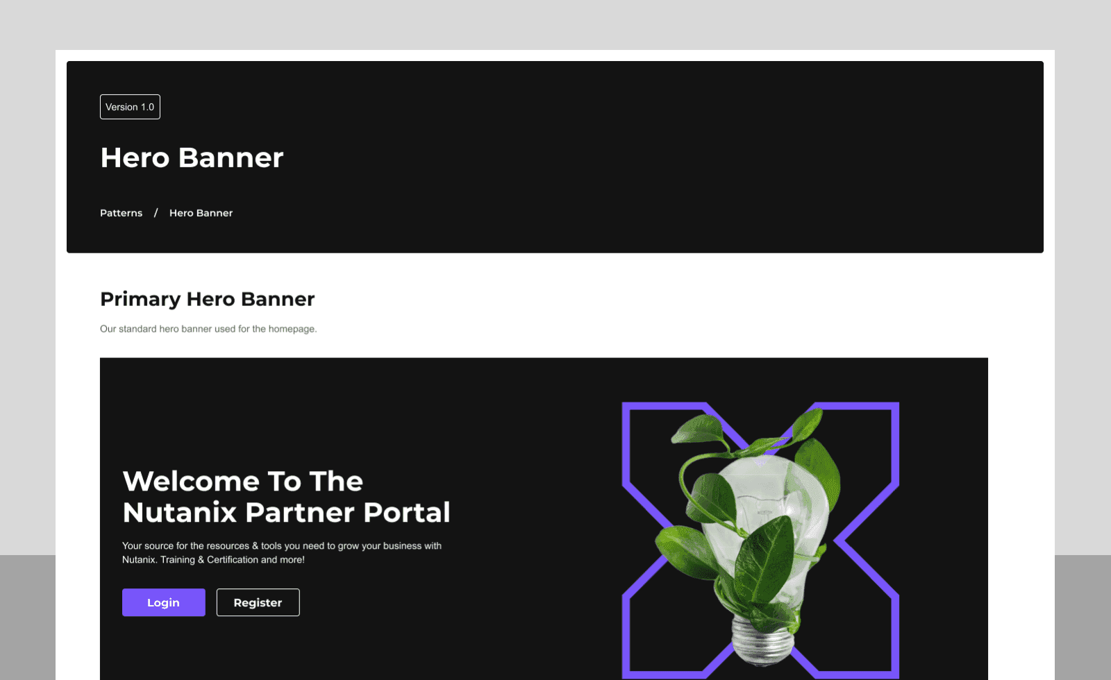
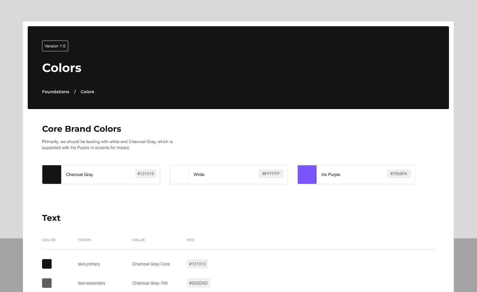
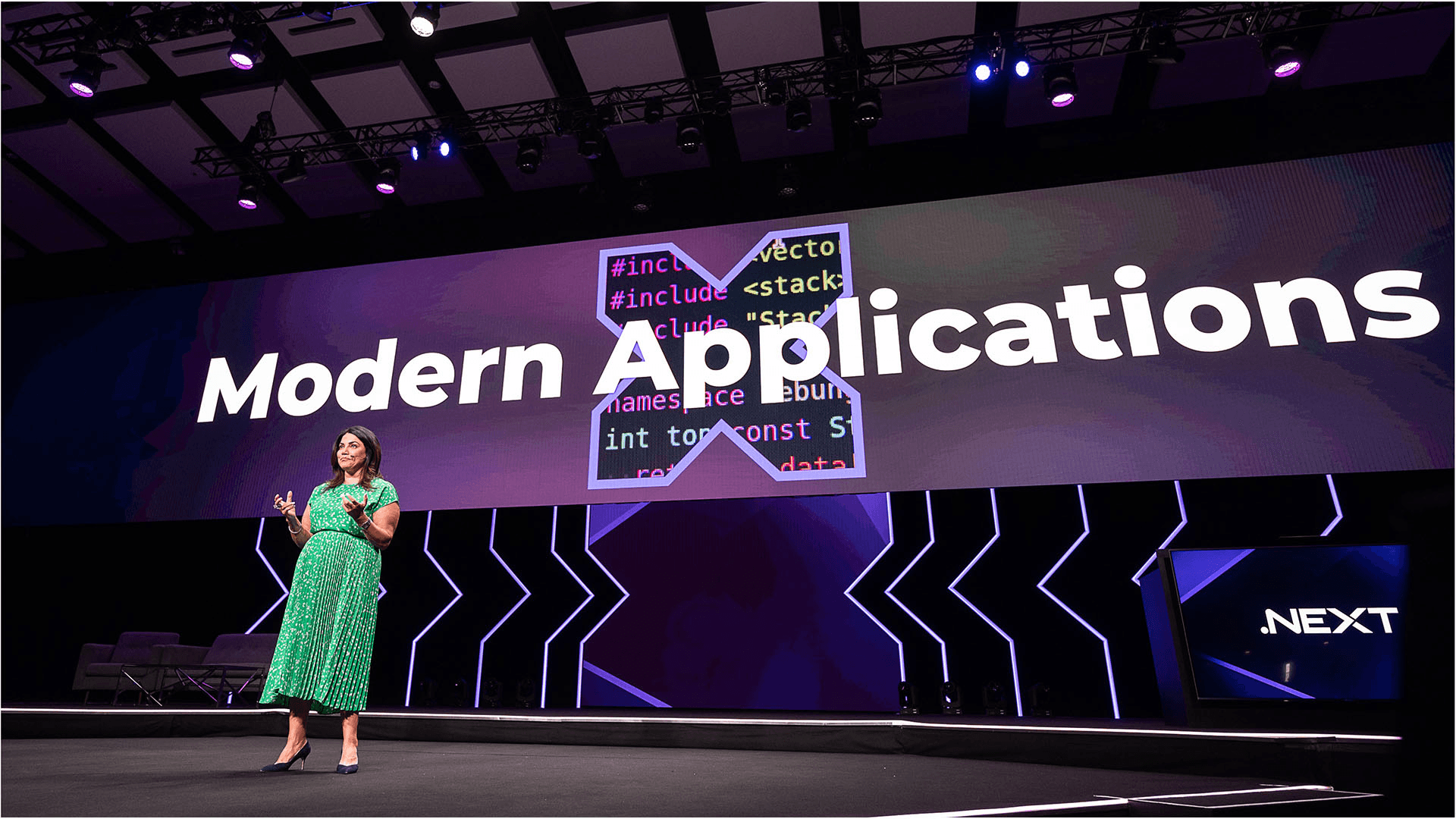
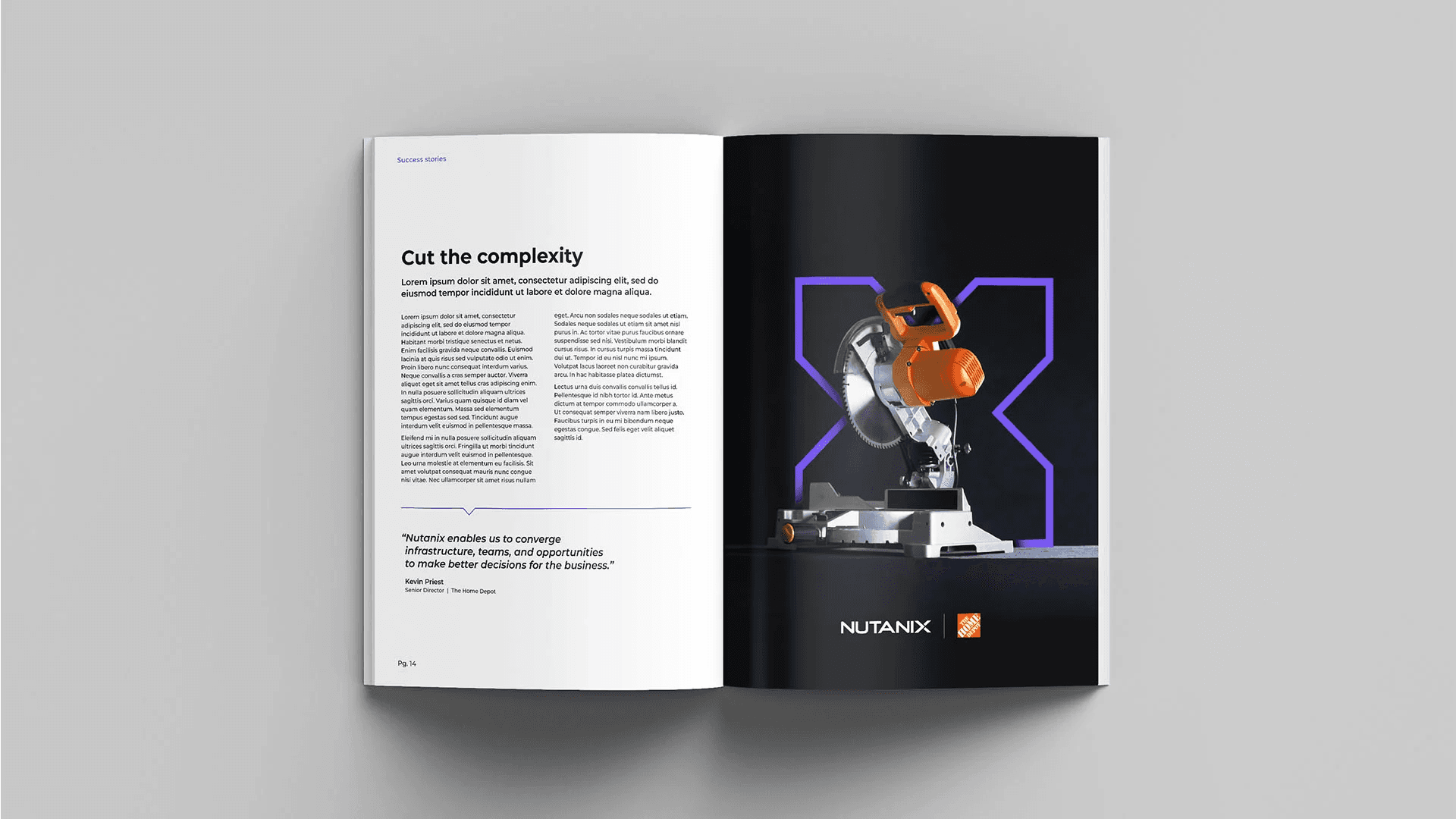
Nutanix went through a rebrand in 2023, reshaping the company's focus from HCI toward hybrid multicloud.
I joined the redesign team as the representative from product, working alongside brand agency TMP and our marketing teams to bring product experience and marketing into alignment.
Rather than treat the rebrand as a one-off creative exercise, the team ran it as an evidence-gathering process: build a direction first, then roll it into formal guidelines. My focus was product surfaces.
The problem
Nutanix's existing visual identity leaned heavily on photography and had converged, stylistically, with several direct competitors. Internal audits found peer companies across hybrid cloud and infrastructure using near-identical approaches: heavy real-world photography, similar color logic, nothing that let the brand stand apart at a glance.
There was no established illustration system either, which limited how the brand could tell a human, story-driven narrative without falling back on stock photography.
And any new direction had to work across a genuinely wide surface: website, product UI, social ads, print collateral. That ruled out picking something that just looked good in one context. It had to hold up as a system.
My role
I was the lead representative for Visual Design & Design Systems at Nutanix from 2022 to 2024, responsible for contributing product direction toward a brand system that could scale from marketing into web and product.
Process & decision rationale
Rather than jump straight to visual exploration, the team ran a staged, evidence-gathering process before committing to a direction.
Competitive and inspirational audits. Before generating anything original, we ran structured audits of how peer and aspirational brands used illustration, photography, and brand devices. Examples got sorted into categories, people and characters and mascots, world-building, data and process visualization, so the team could compare like with like instead of reacting to individual images in isolation.
Structured voting, not opinion in a room. Instead of deferring to the loudest voice in a meeting, we ran a dot-voting exercise. Every participant marked like or dislike on each reference, and we synthesized the results into written conclusions: which categories skewed positive, which felt too close to a competitor, which felt generic. That left a paper trail for why a direction got chosen, not just that it did.
Iteration against stated principles. Early directions were named and tested against brand personality traits, tone-of-voice pillars, and messaging pillars, not judged on aesthetics alone. Directions that scored well visually but drifted from those criteria got cut or revised in later rounds.
Cross-functional and cross-regional input. We built review sessions with regional and cross-functional stakeholders into the process, both before finalizing direction and again before it went into formal brand guidelines.
Once a direction converged, the question shifted from which concept we liked to how it held up as a system: testing the chosen approach across hero-level executions, everyday utility executions, and process and data visualizations, so the same idea could flex across very different uses without looking inconsistent.
The final visual direction was product-informed work that became a core part of the brand system rather than an afterthought. Kacy wrote about the practical application of this work in an article called Beyond the Interface, covering our customer test-drive experience.
Outcomes & evidence
It took a couple of rounds, but we released the redesign at Nutanix .NEXT 2023 in Chicago, the company's first in-person global event since 2019. Our team focused on building product documentation and assets that teams worldwide could actually follow. Rollout continued in phases through 2024, across web applications and product surfaces, with the refreshed brand fully visible at Nutanix .NEXT 2024 in Barcelona as the company socialized its hybrid multicloud positioning.
Reflection
Process was what made a brand this size work. Seeing different directions side by side, and getting the team involved early, gave people ownership and kept the conversation grounded in evidence instead of hierarchy. At Nutanix's scale, that structure isn't optional. It's what drives alignment.
Gallery
Evidence-first exploration
Structured competitive and inspirational audits sorting references by illustration category so the team could compare patterns, not individual mood boards.


Impact
Launched the redesigned brand at Nutanix .NEXT 2023 after multiple review rounds, with continued phased rollout through .NEXT 2024 Barcelona
Launched the redesigned brand at Nutanix .NEXT 2023 after multiple review rounds, with continued phased rollout through .NEXT 2024 BarcelonaPartnered with TMP on marketing and comms asset guidelines adopted by teams worldwide
Partnered with TMP on marketing and comms asset guidelines adopted by teams worldwideBuilt internal design system and web/app documentation aligning product with the new brand
Built internal design system and web/app documentation aligning product with the new brandEstablished illustration libraries that became core to the visual direction across touchpoints
Established illustration libraries that became core to the visual direction across touchpointsIncrease in web engagements 3% Uplift in share of voice
230% Increase in web engagements 3% Uplift in share of voice
Press
Credits
Product Lead
John Torres
Team
Client
Nutanix